Bookworm eBook App.
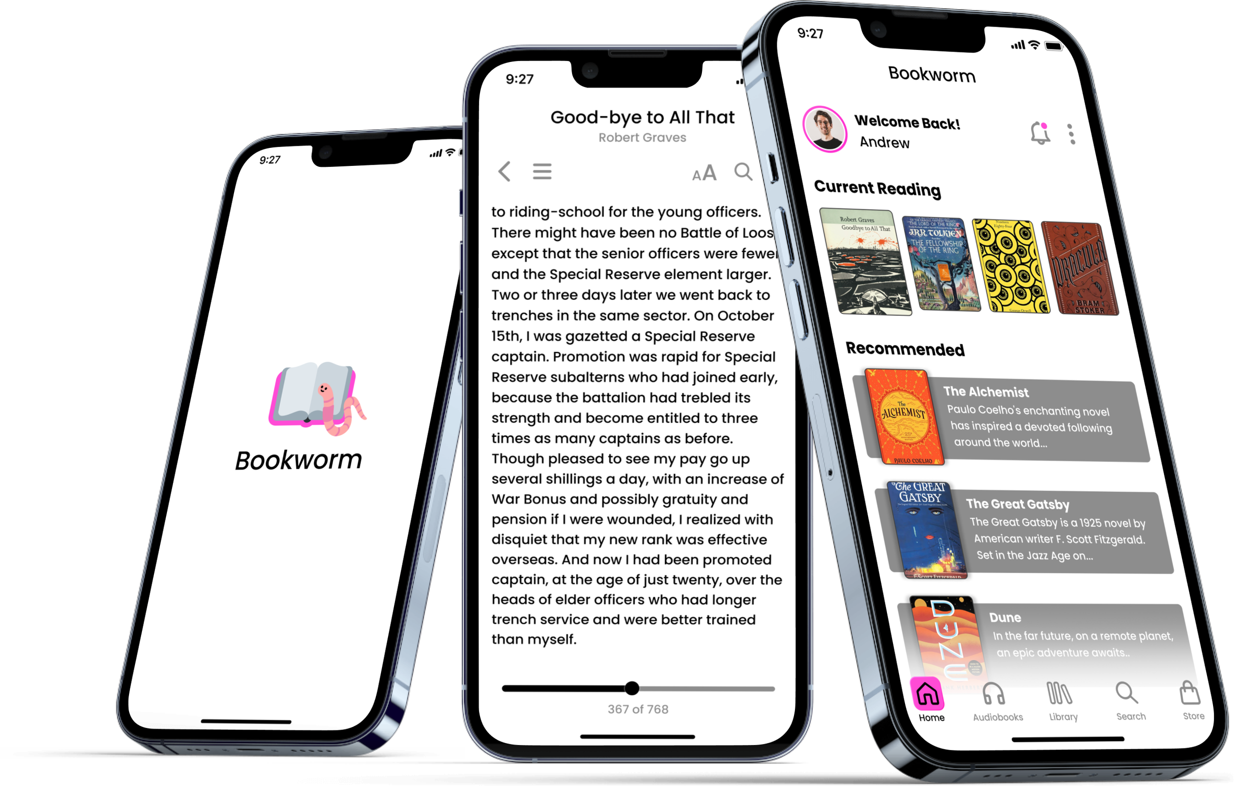
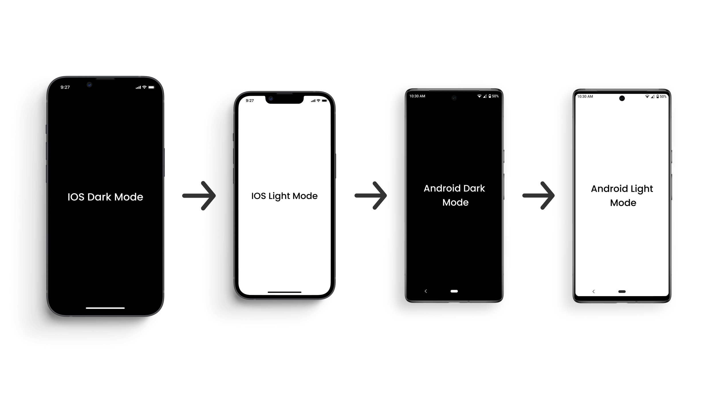
Bookworm was created as a way to experiment with how the same frames can look different in light mode and dark mode, and how frames can look different in IOS and Android. Three frames were created for the Bookworm app and then adapted across the four different variables.

Bookworm Light Mode IOS
The first frames created were light mode IOS frames. Designing this set of frames was very familiar because usually my projects are designed for IOS. Standard IOS margins, type size, and icon size were applied.
Bookworm Dark Mode IOS
The next frames created were for IOS dark mode. A difficulty I ran into at this stage was making sure the same grey was legible for both the light and dark modes. After experimenting with several greys, an adequate one was chosen.

Bookworm Light Mode Android
Differences presented themselves when adapting the three frames to Android. Having never owned or designed for an Android, it was a challenge to adapt the three frames. To remedy this, I consulted with multiple peers who are familiar with Android and researched forums for guidelines and advice.
Bookworm Dark Mode Android
Another difference that presented itself when formatting the three frames for Android was resizing existing assets to appropriately fill the given screen space. This stage was successfully completed by referencing current Android apps and frequently testing the asset placement.
Design Research.
Why?
Before I began this project, I was surprised to learn that IOS only equates to 25% of the global market. From my experience, most UI/UX projects are designed for IOS, leaving 75% of the market as an afterthought. I wanted to create a project that would familiarize myself with designing for Android, and leave me better equipped for professional work.
What?
This project will be built around designing a few key frames for the app in IOS Dark Mode and then adapting them across multiple display settings and operating systems.
Why an e-reader app?
It is estimated that there were 950 million e-reader users in 2019, and it’s estimated that this user base will grow to 1.1 billion by 2023 (Statista). With this in mind, I chose the e-reader market because of its familiarity. I wanted most users to know what the final project should look like, that way there was no room to hide behind an abstract concept.
Bookworm Branding.
An original brand was created for this project. This was done because most eBook apps have heavy association with either IOS, Android, or another product. Bookworm allowed me to create a neutral eBook app, and kept focus on the goal of the project.
Color Palette & Font.
The font family Poppins was chosen to maintain neutrality when adapting the frames from IOS to android. The color palette chosen was relatively simple, implementing four colors. This app uses white, black, and a shade of pink for highlight. The shade of grey was chosen so characters would still be legible whether they were on a white or black background.


